How to Create Three-Columned Website Theme on the Basis of Joomla CMS
In this article I would like to tell you how to create three-columned theme for Joomla website. The most Joomla sites are three-columned and this appears to be a kind of a standard. In addition, you can hide unused columns later.
In fact, it is simpler to create theme for Joomla site with the help of tables, and most people do so. Using of CSS requires more experience – it is more difficult to learn how it doing and some browsers have problems with CSS interpretation. Therefore this article is devoted to a people who have some experience in working with CSS.
Three-columned theme on the basis of CSS.
So, you worked with CSS earlier. Then it would be helpful for you go to http://www.csscreator.com/version2/pagelayout.php – it is a powerful tool for CSS creating.
But in this article we will use another method for layout creation which is absolute positioning. ,I suppose that using of such CSS is the most understandable for beginners. You should just accurately define content position on a page. For example:
#leftcontent {
position:absolute;
top:20px;
left:50px;
width:200px;
}
will create area with width 200px beginning at the point 20px from the top and 50рх from the left. Then let’s try to add images …
At first, let’s define central sector:
#wrapper {
position:relative;
width:560px;
margin: 50px auto;
}
You may note that we have changed positioning type from absolute to relative. Thus we are close to defining of “Document” term and understanding of how elements interact. The following is example of HTML:
<div id="wrapper">
Text in wrapper, blah, ipsum stuff
</div>
<div id="leftcontent">
Leftcontent text, blah and domini and what is the url to generate that random latin?
</div>
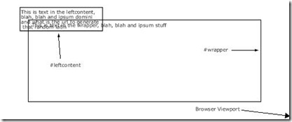
As it is specified, it will look like
Not so good! Now let’s place the left column inside the main window.
<div id="wrapper">
wrapper text, blah, blah and ipsum stuff
<div id="leftcontent">
Text in leftcontent, blah, blah and ipsum domini and what is the url to generate that random latin
</div>
</div> <!– End of the wrapper div–>
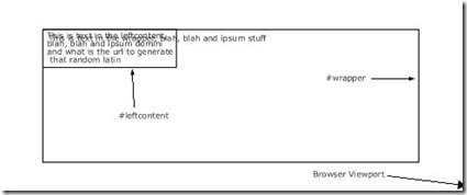
Now our example looks like:
Much better. Text covers the main content but it is not the point for us now. Let’s view CSS which we will use for our page. It is located in the individual layout.css file. This file will be imported to template_css.css later. It is recommended to separate layer from typography when designing and overlap them when finished. It will allow to avoid amount of browser’s errors. The most of them appear when you try to combine elements positioning with padding or with different sizes. Try to avoid using of padding/borders together with elements with a fixed width. It can be reached by placing all positioning operations at one page and padding and borders – at another one (you can combine them later). Thus your site will pass validation test quick.
So, there is our three-columned theme for Joomla:
/* Basic three-column Joomla theme */
body {
margin:10px 10px 0px 10px;
padding:0px;
}
#leftcontent {
position: absolute;
left:10px;
top:100px;
width:200px;
background-color:#fff;
border:1px solid #000;
}
#centercontent {
background-color:#fff;
margin-left: 211px; /*+1 because of the border */
margin-right:211px;
margin-top:7px; /* Indent to align central and side columns */
border:1px solid #000;
}
#rightcontent {
position: absolute;
right:10px;
top:100px;
width:200px;
background-color:#fff;
border:1px solid #000;
}
You can find info about layers adaptation here http://glish.com/css/7.asp. We dropped the most info about CSS to make it easier and because we are not going to create a site with IE5.X support.
And this is not quite simple absolute positioning. Left and right columns are positioned as it described above. And how wee should position center? Absolutely positioned elements are considered as “outside the document”. This means that the rest content is allocated as there are not these elements. You have already seen this at the first example. We have used margins to allocate the central content correctly. Now central text is allocated in the “middle” column.
index.php file have looked like:
<body>
<?php echo $mosConfig_sitename; ?>
<?php mospathway() ?>
<?php mosLoadModules(‘top’);?>
<?php mosLoadModules(‘left’);?>
<?php mosMainBody(); ?>
<?php mosLoadModules(‘right’);?>
<?php mosLoadModules(‘bottom’);?>
<?php include_once(‘includes/footer.php’); ?>
</body>
</html>
Then let’s put positioning CSS tags there
<body>
<?php echo $mosConfig_sitename; ?>
<?php mospathway() ?>
<?php mosLoadModules(‘top’);?>
<div id="leftcontent">
<?php mosLoadModules(‘left’);?>
</div>
<div id="centercontent">
<?php mosMainBody(); ?>
</div>
<div id="rightcontent">
<?php mosLoadModules(‘right’);?>
</div>
<?php mosLoadModules(‘bottom’);?>
<?php include_once(‘includes/footer.php’); ?>
</body>
So, we have got three-columned Joomla theme. It’s not bad for a start. You can view the example of this theme here: http://livesite.compassdesigns.net. All columns are at their places. Changing browser window sizes, you’ll see that size of the central column only will be changed. This is called flexible CSS layout. Viewing the page through IE6 we’ll see a little mismatch at the bottom of the left column – don’t warro about it.
Now the site is valid. We have abided by the W3C Standards Compliant CSS Joomla Website.


